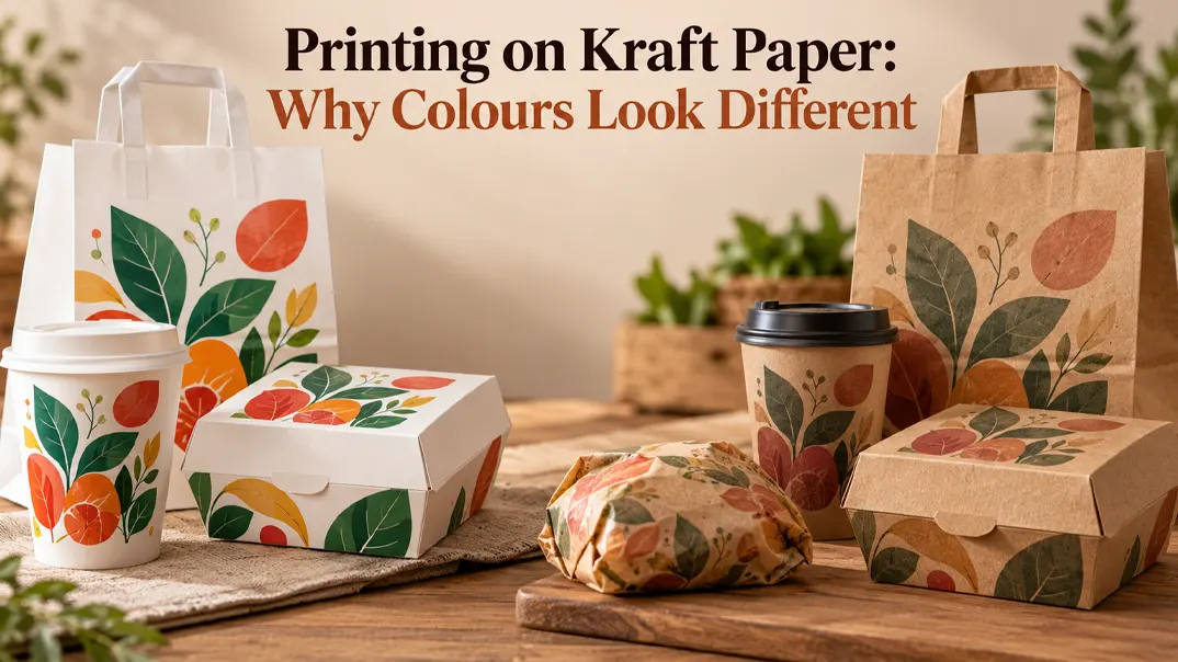
Printing on kraft paper can make your logo look darker, duller, or less vibrant than it does on screen. This is common with kraft food packaging because the paper’s natural brown colour affects how ink appears. The good news is that you can often improve the result by adjusting your artwork, choosing a suitable printing method, or using a different paper surface. This guide explains why these colour differences happen and how to get better results for your packaging.
Why Does Your Logo Look Different on Kraft Paper?

The main reason is that kraft paper has a natural brown base that affects how printed colours appear. Unlike white paper, which provides a neutral background, brown kraft changes the colour you see, especially when the ink is light or partly transparent.
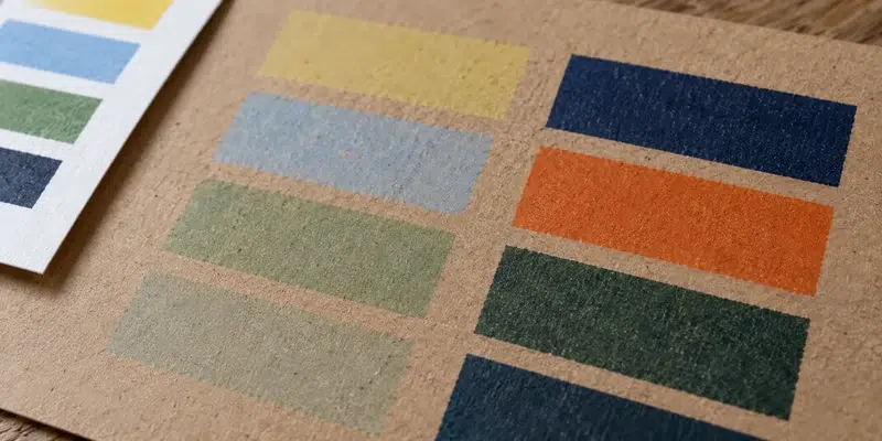
Most standard printing inks are not fully opaque, so some of the paper’s colour can show through. A bright yellow may look duller, pale blue may appear greyish, and light pink may take on a brownish tone. Dark colours generally provide stronger contrast, although their appearance can still differ from the original design.
White areas need particular attention. In standard printing, white is usually the unprinted area of the design. On kraft packaging, that means the brown paper remains visible unless white ink is applied.
The surface changes the result as well. Kraft grades vary in shade and smoothness. On a rougher, more absorbent sheet, fine details can look softer and a large block of colour can print less evenly.
How Can You Tell What Caused the Mismatch?
Compare the sample with the reference you approved, then look for the pattern of the difference. A screen image, a white-paper proof, and a printed kraft box are three different references. The table gives you a useful first check; it does not diagnose a press problem from a photo alone.
| What you notice | Likely starting point | What to ask or compare |
|---|---|---|
| Every colour looks duller on kraft than on the white proof | The brown paper is showing through the ink. | Ask for the logo printed on the proposed kraft stock. |
| A white part of the logo appears brown | White was treated as unprinted space. | Check whether white ink was specified and is available for this print route. |
| A large colour area looks patchy or small text looks soft | Paper texture, ink coverage, or the print process may be involved. | Examine a full-size sample and confirm the paper grade and print method. |
| A repeat order looks different from the approved sample | Paper shade, ink, finish, or production setup may have changed. | Compare the two physical packs and their recorded material and artwork versions. |
A change from a white proof to kraft is expected. A change from an approved kraft sample is a different problem. Compare the unprinted paper shade first; if it matches, ask the supplier to check the ink, finish, and print setup against the agreed specification.
How Can You Get Better Printing on Kraft Paper?
The best way to improve print colours on kraft paper depends on your design and how closely the finished packaging needs to match your brand colours. For a simple logo, adjusting the artwork may be enough. If your design uses light colours or detailed images, you may need white ink or a different printing surface.
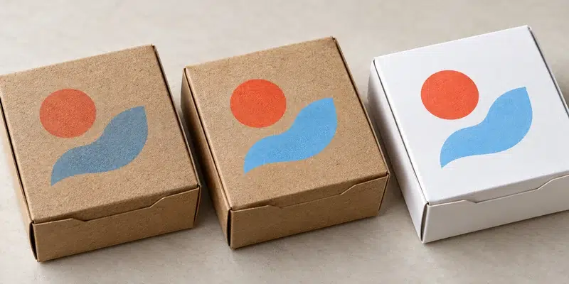
Adjust the Artwork for a Brown Background
If you want to keep the natural kraft look, start by choosing colours that stand out against the brown paper. Dark green, navy, black, and other strong colours generally offer better contrast than pale yellow, light blue, or pastel shades.
You may also need to adjust the colour values in your artwork and make fine text or thin lines slightly bolder. However, changing the digital colour alone cannot guarantee the printed result. Ask for a sample on the intended kraft paper to see whether the revised design remains clear and recognisable.
Use White Ink Under Selected Colours
White ink can create a lighter base beneath other colours, reducing the influence of the brown paper. This can be useful when your logo contains light colours or when a particular brand colour needs to appear brighter.
The white layer must be applied in the right areas and registered accurately with the colours printed over it. Not every printing method supports this option, and the extra ink layer may affect cost and production requirements. Confirm its availability with your supplier and review a physical sample before making a decision.
Choose a White Printing Surface
If your food packaging design relies on pale colours, colour gradients, or detailed food photography, printing on a white surface may provide a more predictable result. Depending on the packaging format, you could consider white-faced paperboard or another suitable white stock instead of natural brown kraft.
This option changes the appearance of the packaging, so it may not suit brands that want to preserve the natural kraft aesthetic. When choosing an alternative, also check its suitability for the intended food packaging application, including the required barrier properties and packaging construction.
The key is to match the printing solution to your design priorities. If the natural brown appearance matters most, work with the kraft paper rather than trying to make every colour look identical to its screen version. If accurate colour reproduction is essential, discuss white ink or a white printing surface with your supplier before approving the final artwork.
What Should You Tell Your Packaging Supplier?
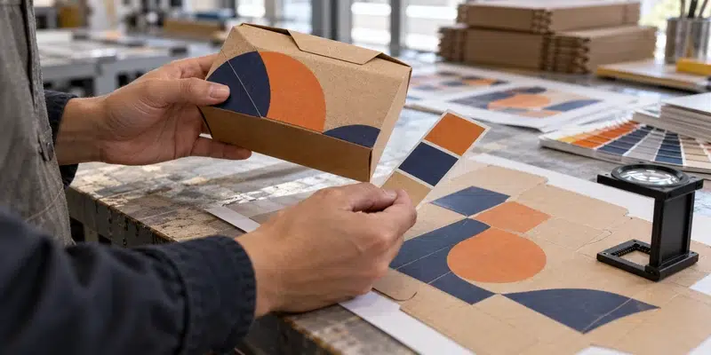
To get the colour you expect, give your packaging supplier more than a logo file and a colour code. The paper, printing method, and required colour accuracy all affect the final result, so clarify these details before production begins.
Start by providing your packaging dieline, an editable logo, and your target colour references, such as Pantone or CMYK values. Specify which part of the package will be printed and whether any areas need to appear white. If you are using kraft paper, tell the supplier whether you want to preserve its natural brown appearance or prioritise closer colour matching.
It also helps to identify which colours matter most to your brand. A small difference in a decorative element may be acceptable, while a noticeable shift in your main logo colour may not be. Ask the supplier which paper grade and printing method they recommend, whether white ink is an option, and what level of colour consistency can realistically be achieved.
For example, you could say: “We want to print our green logo on the outside of a kraft takeaway box. The attached colour is our target. Please recommend a suitable paper and printing method, and provide a sample so we can check the colour before production.”
The clearer your requirements are at this stage, the easier it is to choose the right printing solution and avoid misunderstandings when reviewing the sample.
FAQs
Can Kraft Paper Printing Match Pantone Colours Exactly?
Not always. The brown base of kraft paper affects how ink colours appear, even when the Pantone reference is correct. When working on custom packaging, we recommend testing the colour on the actual kraft paper first. If a brand colour needs to be closely matched, we can also explore white ink or a different printing surface to improve the result.
Is Digital Printing or Flexographic Printing Better for Kraft Packaging?
It depends on your packaging design, order quantity, and printing requirements. Digital printing can be suitable for shorter runs, while flexographic printing is often used for larger orders. We look at the product specifications and artwork before recommending a suitable method, so you can balance print quality, production requirements, and cost.
Can the Same Logo Colour Match on a Kraft Box and a Paper Cup?
It can look similar, but do not use one product’s proof to approve another. Cups and boxes may use different paper shades, coatings, and printing methods. Compare finished samples side by side and agree which differences are acceptable across your packaging range.
Can You Print a Barcode Directly on Brown Kraft?
Yes, if the finished code has enough contrast and scans reliably. Brown paper may be too dark or uneven for some combinations. Keep the required clear space around the code and test it on the final printed pack.
Does the Size of My Order Affect My Kraft Packaging Printing Options?
Yes. Order quantity can affect which printing methods are practical and how production costs are calculated. When discussing a project, we consider the packaging format, artwork, quantity, and colour requirements together to identify suitable options. If you are ordering several packaging sizes or planning a trial run before a larger order, let us know so we can evaluate the requirements accordingly.
Conclusion
Printing on kraft paper is about finding the right balance between your brand colours and the natural look of the material. A colour that works on screen may need adjustments to look right on brown paper, so it is worth considering the printing method and paper surface before finalising your design. At Million Pack, we help customers evaluate these options for their custom food packaging, from choosing suitable materials to checking print samples. This way, you can make informed decisions about your packaging’s appearance before moving into production.